The Psychology Behind Starbucks
November 8, 2021
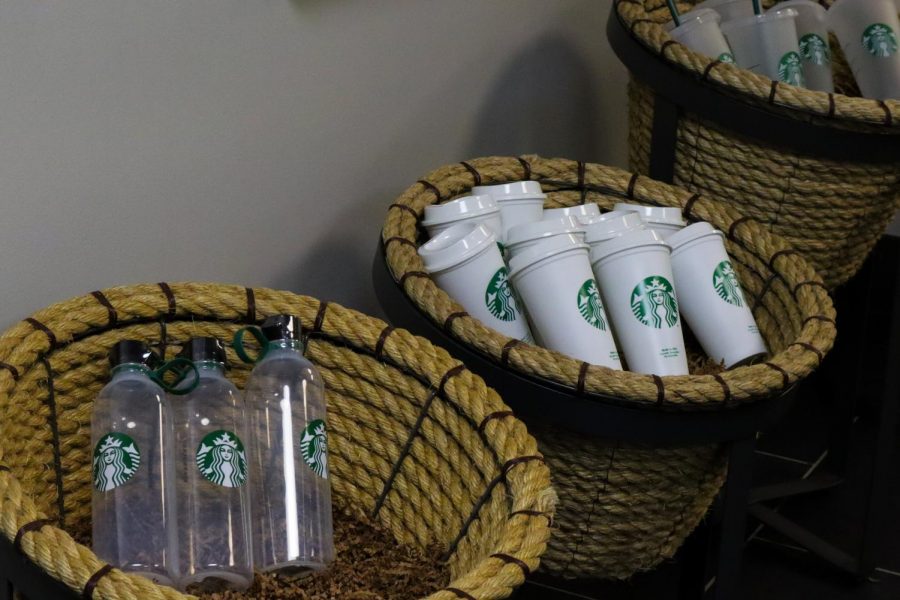
It’s inevitable. In almost every corner of the city, on every block in the suburbs and even in schools, more often than not, you’ll find a Starbucks there. Whether you’re an avid consumer of Starbucks or a casual buyer of a drink here and there, there’s no doubt that people will continue to come back for more. The question is: why?
Perhaps it’s the accessibility and convenience that brings people back. Perhaps it’s the customer service and the atmosphere. Or perhaps the drinks and the food are really just that good. However, even with all these aspects, the chain itself puts more intention into their branding and customer relations than at first glance.
Everything — from the way the menus are written to the placement of the chairs to even why they write names on the cups — is a marketing tactic to get you to come back and spend more. It’s quite impressive.
Let’s start from the walk in. The lighting: The more energy in light, the more the sensors in our eyes are stimulated and the lighter we perceive the object to be. According to a Human Vision and Color Perception study conducted at the Microscopy Resource Center, “The first steps in this sensory process are the stimulation of light receptors in the eyes, conversion of the light stimuli or images into signals, and transmission of electrical signals containing the vision information from each eye to the brain through the optic nerves.” Therefore, we’re naturally attracted to brighter areas in our field of vision. The lighting in Starbucks is focused on the cash register area and the shelves with the products. Everything else is dimmer. That’s because people react to well-lit areas and feel more compelled to make purchases. The light leads you in the desired direction and draws your attention to the products they want to sell most.
Beyond lighting, the furniture also plays a role. If you’re in a Starbucks in a busy city, then most likely the chairs will be less comfortable. Why? It’s so people who are sitting don’t stay long, and therefore will make room for more customers. However, a Starbucks on an emptier street is much different. It’s all intentional.
Now, the menu. No matter which Starbucks it is or what iteration of the menu is presented to you, the middle is just where your eyes will go first. This is called the “Center Stage Effect” as explained by Kent Hendricks, the Director of Marketing at Zondervan Academic. Starbucks is very strategic in utilizing this effect when it comes to their products. That’s why the drinks are usually in the center, rather than the food items, as that’s what they’re known for. That’s why you’re most likely to order the grande size. Grande is what is presented in the middle. Not only that, but it’s the compromise between the two extremes of small and large. This is also called the “Compromise Effect,” as studied by Xinqian Li at Jinan University, the School of Management.
Their menus also do not include the dollar sign. The dollar sign is a reference to money. Money means spending, and spending is negative. Sure, you know you’re spending money, but you don’t want to be reminded of just how much you’re spending. Removing the dollar sign makes the consumer spend more without even meaning to. That is also why Starbucks has higher prices in coffees than other coffee brands. A Harvard Business Review deemed this as the “Starbucks Effect.”
The reason Starbucks raises their prices is that a higher price is associated with higher quality, as studied by D P S Verma and Soma Sen Gupta at the University of Delhi. They charge more for what used to be cheap and dress it in a “premium” customer experience. That is also why they write names on the cups: to make your experience feel more personalized as opposed to a McDonald’s or a Dunkin’ Donuts. Also why the coffee machines are shorter so you can be sure you’ll see the barista. They believe that customers should feel a personal connection to those who are working there to help ensure a good experience.
They also want to make sure you aren’t missing out on their seasonal or exclusive items. Another marketing tactic involved “Fear of Missing Out,” or FOMO. Starbucks is known for their limited-time drinks; you feel more compelled to buy them while they’re out, or you won’t get the chance to for a long time. It’s all to get you to spend more on their product.
It’s all strategic in regards to the company and their stores. At the College of DuPage, the Starbucks is located in a very accessible location to college students and staff, causing sales to be more successful. So, although you may be more conscious about Starbucks marketing strategies, they can still have a powerful influence enough to get you to come back.


